
Graphical skills are essential for an architect. At the beginning stages of your career, those skills will help you stand out and draw attention to your projects.
I would even say that a mediocre project idea with excellent graphic presentation seems to be appreciated better than an excellent design idea that is poorly presented.
Architectural graphics have been my passion when I studied and then worked in architecture studios.
The reason was that the design ideas at workplaces are dictated mainly by senior architects and studio owners. The only creative freedom I had was the graphic representation.
So here are my 3 tips to help you create a stunning architecture drawing for school, for work or for your architecture portfolio.
1. Master the Basics of Line Weight
Proper use of line weight can drastically enhance the clarity and hierarchy of your drawings.
Learn how to balance line thickness to make your drawings easy to read and visually compelling.
If I am drawing a section or a floor plan, I usually use the thickest lines for things being cut: walls. The second thickest lines belong to the building itself. These lines should not be too thick, but definitely slightly thicker than the entourage lines, such as plants and people.
Lastly, I use very thin and mildly lighter tone lines for things like furniture, people, or plants.
2. Incorporate Textures and Shadows for Depth
This tip is not applicable for all situations. If you are doing a 2d floor plan in a minimalist style, then probably you should not add shadows. Instead, work with line weights.
I would say, if you are working on a perspective section or a 3d floor plan, then shadows would make the drawing easier to read.
3. Utilize Color Strategically
While architecture drawings are often in black and white, subtle uses of color can emphasize key elements of your design.
I like to use colors in concept diagrams.
The key is to not overload your drawings with colors.
I would say, pick 1 color and use it.
Instead of 1 concept diagram where you show 3 different things on same drawing with different colors, create 3 diagrams where everything is black and white except for that 1 thing you want to emphasize.
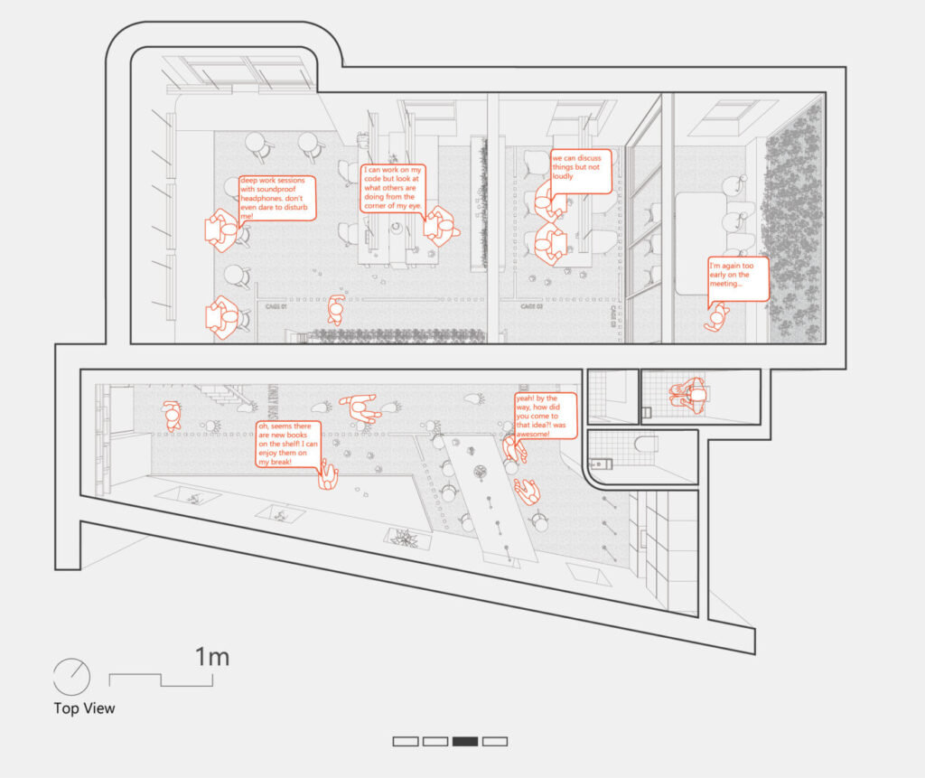
4. Focus on Storytelling through Drawings
Every drawing should tell a story about your design process. Think of your graphics as a narrative tool to convey your concept. Whether for a school project, work presentation, or portfolio piece, your drawings should guide the viewer through your design intention and process seamlessly.
Use line thickness to distinguish between main and secondary things on the drawing.
Use color to emphasize what you are talking about and how concepts connect.
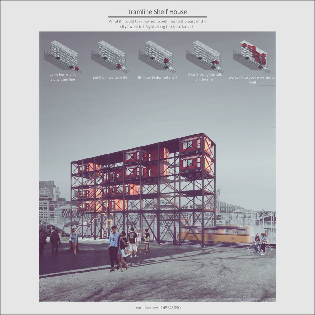
For example, in this drawing, I decided to keep the drawing greyscale while emphasizing the storytelling elements with red color.
Conclusion
With these tips in mind, you can strategically improve your architectural graphic representation and take your portfolio to the next level!
If you need more help, do not hesitate to reach out. We can discuss how I can help you improve your portfolio & make yourself more competitive on job market!